| | Critique Thread |  |
|
+10jakeodonnell Blake Devin Catron ottom Alec Backhus NateBorchers Phil Lagettie grantschofield coreywakeman Sam Scott 14 posters |
|
| Author | Message |
|---|
Sam Scott

Posts : 27
Join date : 2010-12-29
Location : Pleasanton, California
|  Subject: Critique Thread Subject: Critique Thread  Sun Jan 02, 2011 10:46 pm Sun Jan 02, 2011 10:46 pm | |
| Basically a place for people to post pictures that they think are good (or not so good), and for everybody else to tear them apart with brutal criticism. None of that pansy "Oh, the colors are nice and I like what you're doing here, but the toning could use some work. It's still a good shot though!" In here, we're looking for our shots to be torn to shreds full of solid advice. No just plain beat downs (ie 'd00d ur ph0t0 sucksorz trololol'). Stuff more like "Composition needs a lot of work, it's way too centered and framing throws it all off. Toning is way off, I'd bet that would look better with warmer tones. DOF is super narrow, stop down a bit so you can get more in focus." We want this to be a place to get help with photos and learn how to put more thoughts into our work, not just point and shoot. Rules:- One photo posted at a time
- There should be at least one, preferably two critiques for each photo before the next is posted
- You can provide critique and a new picture in the same post
- Constructive, in depth criticism is a lot better, so please put some thought into it
- If there is stuff you already know is bad with your photo, put that in with the post so people don't keep retouching that subject.
- Post photos at preferably 500byXXX or 640byXXX resolution so people can see detail about what they're critiquing. If posting at 500byXXX or smaller, provide a link to larger resolutions.
I can't think of anymore currently, but if I do then I'll add to them. The more people that contribute the better! I'll start with one of my favorite photos, but I do think I could have a touch more light on the back of the legs so they don't blend with the trees so much.  | |
|
| | |
coreywakeman

Posts : 16
Join date : 2011-01-03
Age : 29
Location : FUCKING ENGLAND !!
| | Subject: Re: Critique Thread Mon Jan 03, 2011 1:18 am | |
| another flash on the right side make him stand out from the background but have to say nice colours | |
|
| | |
grantschofield
Posts : 4
Join date : 2011-01-03
| | Subject: Re: Critique Thread Mon Jan 03, 2011 2:45 am | |
| i now this is for photos but in all the nor cal videos i see that spot where is it? | |
|
| | |
Phil Lagettie
Posts : 10
Join date : 2011-01-02
Age : 34
Location : Sydney, Australia
| | Subject: Re: Critique Thread Mon Jan 03, 2011 3:44 am | |
| Great thread Sam. I personally love the amount of head room you have left in that image, allowing the trees to be a direct line of focus. Agreed about the light on the back legs, but hey still a banging image. This is one of my newest photos. 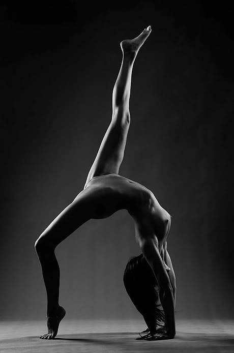 Shot on a Nikon D3sLens - 70-200mm 2.8 VRII @120mm Speedlites - 3 x SB900 / 2 shot through UB33-Wt -translucent Umbrellas and one bounced directly off the celling. Shooting details: Shutter - 1/320th sec Aperture - F10 ISO - 400 AutoFP - 320th/s File - NEF (Raw) This was a different photo for me, after shooting for 2 hours I knew this was the one I was after. So many times I find we may take 500 photos over a day and walk away with a smile knowing we got that 1 shot, I felt that in this situation. Comments are welcome. | |
|
| | |
NateBorchers

Posts : 30
Join date : 2011-01-03
Location : Pleasanton, CA
| | Subject: Re: Critique Thread Mon Jan 03, 2011 3:46 am | |
| I would try to soften the areas around the model, not sure if it's just my computer but they looked pixelated. And some light around the leg touching the ground wouldn't hurt. If I were to retry this I would probably add some more contrast. 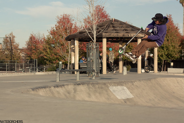 | |
|
| | |
Phil Lagettie
Posts : 10
Join date : 2011-01-02
Age : 34
Location : Sydney, Australia
| | Subject: Re: Critique Thread Mon Jan 03, 2011 4:07 am | |
| pixelated?
hmm, Keeping in mind this is a compressed jpeg for web. | |
|
| | |
NateBorchers
Posts : 30
Join date : 2011-01-03
Location : Pleasanton, CA
| | Subject: Re: Critique Thread Mon Jan 03, 2011 4:12 am | |
| My mistake, I forgot about the fact the images are compressed. | |
|
| | |
Alec Backhus
Posts : 12
Join date : 2011-01-03
Age : 29
Location : Orange county, CA
| | Subject: Re: Critique Thread Mon Jan 03, 2011 4:23 am | |
| https://i.servimg.com/u/f64/16/04/20/49/dsc_0215.jpg
I agree you need a little more contrast between the rider and the back ground, also try to put the rider more in the right third of the frame , but great timing. | |
|
| | |
Sam Scott
Posts : 27
Join date : 2010-12-29
Location : Pleasanton, California
| | Subject: Re: Critique Thread Mon Jan 03, 2011 4:59 am | |
| @Grant: It's a hidden away spot in Pleasanton that's super fun, and a sweet environment to shoot in.
@Phil: Thanks man! I think a good critique thread is a requirement for a solid photo/video forum. As far as your photo goes, I would have centered her a little more. The leg is mostly centered, but the rest of her seems slightly closer to the left. An addition bit of symmetry wouldn't go amiss there.
@Nate: I dig the muted tones you got going on there, but the tree in upper right corner is really distracting. Also, the leading lines draw your eye away from the rider, which is kind of annoying. Try to find places where lines converge a lot, and place your subject there, because the eye is naturally drawn to places like that. It'll usually skim over big empty spaces to an extent, so a good balance between positive and negative space is hard to come by.
@Alec: Very point and shoot style shot. Looks like you just left the camera on the ground and set the timer for the picture. The flash is really harsh and the hotspot on the ground at the bottom is extremely annoying. I'd suggest putting a little thought into the shot before just plopping the camera down any old which way to get a shot, 30-60 seconds of thought beforehand can make huge amounts of difference in the final result. | |
|
| | |
coreywakeman
Posts : 16
Join date : 2011-01-03
Age : 29
Location : FUCKING ENGLAND !!
| | Subject: Re: Critique Thread Mon Jan 03, 2011 12:48 pm | |
|  Nikon d40 Nikon 18-55 Jessops 360afdn flashgun comments welcome  | |
|
| | |
ottom

Posts : 13
Join date : 2011-01-03
Age : 29
Location : Finland
| | Subject: Re: Critique Thread Mon Jan 03, 2011 1:12 pm | |
| Composition is boring. Try not to put your object center. And wheres that vignetting coming from? | |
|
| | |
NateBorchers
Posts : 30
Join date : 2011-01-03
Location : Pleasanton, CA
| | Subject: Re: Critique Thread Mon Jan 03, 2011 5:37 pm | |
| ^ I agree, the composition is boring, I would change the flash placement and the angle of your shot. | |
|
| | |
coreywakeman
Posts : 16
Join date : 2011-01-03
Age : 29
Location : FUCKING ENGLAND !!
| | Subject: Re: Critique Thread Mon Jan 03, 2011 5:53 pm | |
| thanks guys always like to know how i can get better | |
|
| | |
Alec Backhus
Posts : 12
Join date : 2011-01-03
Age : 29
Location : Orange county, CA
| | Subject: Re: Critique Thread Tue Jan 04, 2011 5:43 am | |
| https://i.servimg.com/u/f34/16/04/20/49/dsc_0110.jpg
I know I need to work on the contrast between the white doughnut and the background and the white balance. | |
|
| | |
Alec Backhus
Posts : 12
Join date : 2011-01-03
Age : 29
Location : Orange county, CA
| | Subject: Re: Critique Thread Tue Jan 04, 2011 5:43 am | |
| also the colors come up a little dull when you click on he link they are much more vibrant. | |
|
| | |
ottom
Posts : 13
Join date : 2011-01-03
Age : 29
Location : Finland
| | Subject: Re: Critique Thread Tue Jan 04, 2011 6:32 pm | |
| Thats badly overexposed. I think that everything should be in focus, not only one donut. And that darker spot on the corner looks bad. | |
|
| | |
Devin Catron
Posts : 7
Join date : 2011-01-03
Age : 30
Location : Murrieta,CA
| | Subject: Re: Critique Thread Tue Jan 04, 2011 7:21 pm | |
| From my last trip. any comments?  Orange Sky by Devin Catron, on Flickr | |
|
| | |
Blake

Posts : 145
Join date : 2011-01-03
Location : Australia
| | Subject: Re: Critique Thread Wed Jan 05, 2011 7:50 am | |
| Foreground is too under-exposed. I like the symmetrical placement of the photo though.  | |
|
| | |
NateBorchers
Posts : 30
Join date : 2011-01-03
Location : Pleasanton, CA
| | Subject: Re: Critique Thread Wed Jan 05, 2011 2:33 pm | |
| Too big of an out of focus object for the shot. Try and lower you angle a bit. | |
|
| | |
Blake
Posts : 145
Join date : 2011-01-03
Location : Australia
| | Subject: Re: Critique Thread Thu Jan 06, 2011 5:06 am | |
| | |
|
| | |
jakeodonnell

Posts : 5
Join date : 2011-01-06
Age : 29
| | Subject: Re: Critique Thread Thu Jan 06, 2011 5:53 pm | |
| alec, it looks maybe out of focus a bit? blake, the subject seems kind of boring to me, and centered a little too much for my liking one of my favorites of mike taken with canon XT canon 50mm f/1.8  | |
|
| | |
ColterLammey
Posts : 36
Join date : 2011-01-03
Location : Bozeman, MT
| | Subject: Re: Critique Thread Thu Jan 06, 2011 10:00 pm | |
|  A picture I took on my trip to Cali, its got alot of lens flare but I think it looks pretty good. | |
|
| | |
Blake
Posts : 145
Join date : 2011-01-03
Location : Australia
| | Subject: Re: Critique Thread Thu Jan 06, 2011 10:23 pm | |
| @Jake, that photo is quite amazing to glance at for a quick second but then when you look it more deeply your eyes tend to look straight into the darkness behind Mike which is really distracting.
| |
|
| | |
NateBorchers
Posts : 30
Join date : 2011-01-03
Location : Pleasanton, CA
| | Subject: Re: Critique Thread Fri Jan 07, 2011 12:43 am | |
| @ ColterLammey Looks pretty good, the large amount of sun is a bit excessive and if there had been less of the actual sun showing you could've gotten some more interesting lens flares. Composition is very busy however and is quite distracting. | |
|
| | |
ottom
Posts : 13
Join date : 2011-01-03
Age : 29
Location : Finland
| | Subject: Re: Critique Thread Sat Jan 08, 2011 12:22 pm | |
| Canon 1000D Samyang 8mm One flash with trigger, i might get another one some day. This was first day shooting with triggers. 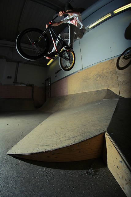 | |
|
| | |
Sponsored content
| | Subject: Re: Critique Thread | |
| |
|
| | |
| | Critique Thread | |
|


